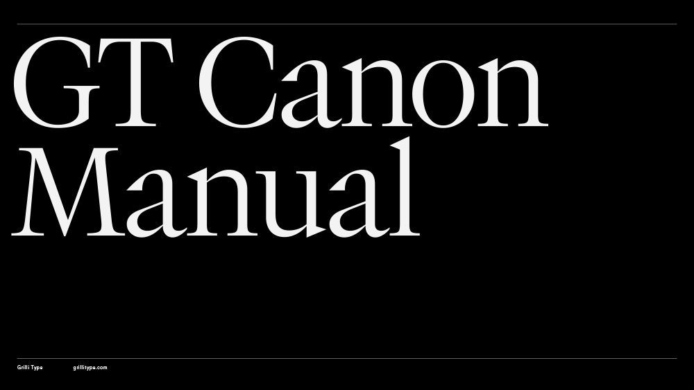
GT Canon

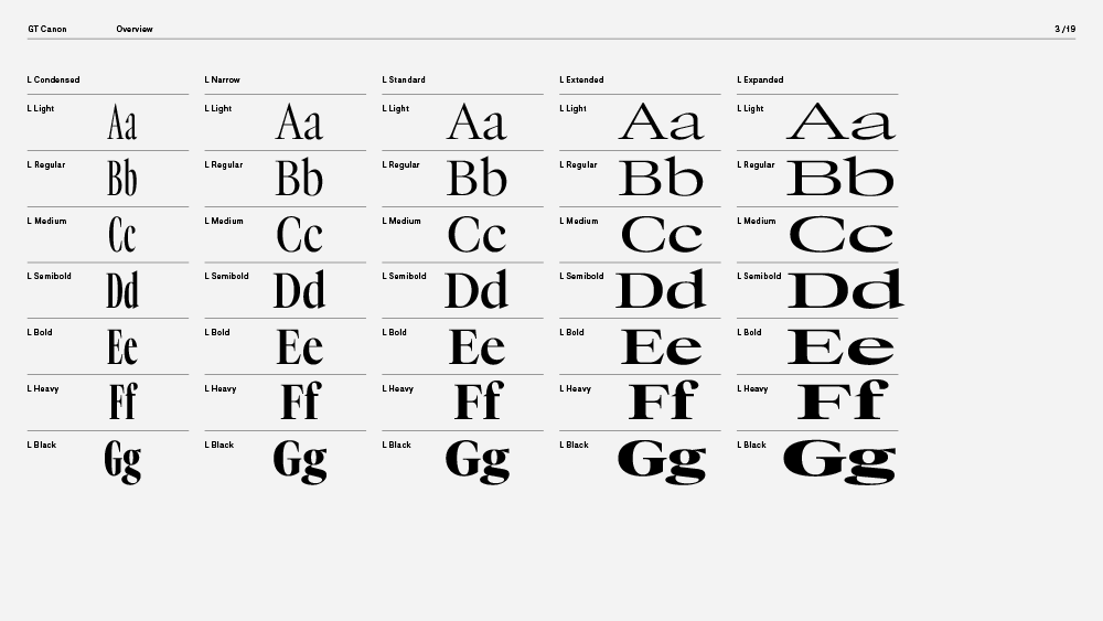
Family overview
- Condensed
- S Light Italic
- M Light Italic
- L Light Italic
- S Regular Italic
- M Regular Italic
- L Regular Italic
- S Medium Italic
- M Medium Italic
- L Medium Italic
- S Semibold Italic
- M Semibold Italic
- L Semibold Italic
- S Bold Italic
- M Bold Italic
- L Bold Italic
- S Heavy Italic
- M Heavy Italic
- L Heavy Italic
- S Black Italic
- M Black Italic
- L Black Italic
- Narrow
- S Light Italic
- M Light Italic
- L Light Italic
- S Regular Italic
- M Regular Italic
- L Regular Italic
- S Medium Italic
- M Medium Italic
- L Medium Italic
- S Semibold Italic
- M Semibold Italic
- L Semibold Italic
- S Bold Italic
- M Bold Italic
- L Bold Italic
- S Heavy Italic
- M Heavy Italic
- L Heavy Italic
- S Black Italic
- M Black Italic
- L Black Italic
- Standard
- S Light Italic
- M Light Italic
- L Light Italic
- S Regular Italic
- M Regular Italic
- L Regular Italic
- S Medium Italic
- M Medium Italic
- L Medium Italic
- S Semibold Italic
- M Semibold Italic
- L Semibold Italic
- S Bold Italic
- M Bold Italic
- L Bold Italic
- S Heavy Italic
- M Heavy Italic
- L Heavy Italic
- S Black Italic
- M Black Italic
- L Black Italic
- Extended
- S Light Italic
- M Light Italic
- L Light Italic
- S Regular Italic
- M Regular Italic
- L Regular Italic
- S Medium Italic
- M Medium Italic
- L Medium Italic
- S Semibold Italic
- M Semibold Italic
- L Semibold Italic
- S Bold Italic
- M Bold Italic
- L Bold Italic
- S Heavy Italic
- M Heavy Italic
- L Heavy Italic
- S Black Italic
- M Black Italic
- L Black Italic
- Expanded
- Mono
- Light Italic
- Regular Italic
- Medium Italic
- Semibold Italic
- Bold Italic
- Heavy Italic
- Black Italic
Subfamilies
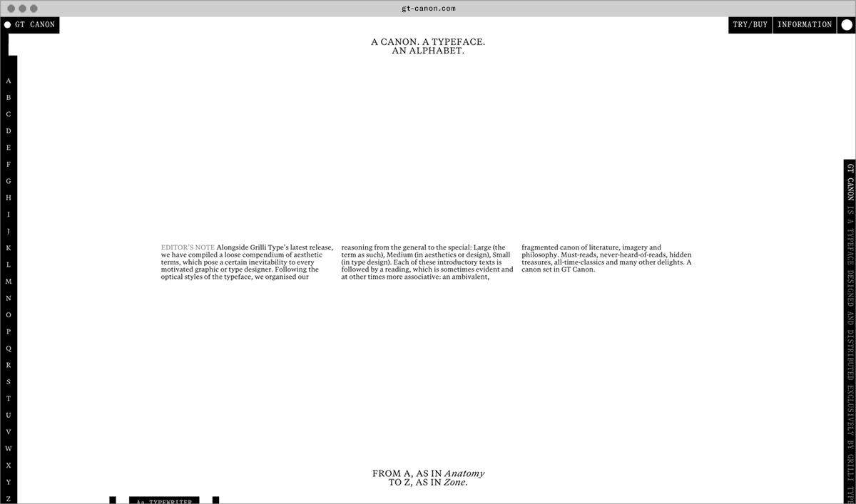
- Standard S LightOnly that is limited can invite, can expand and intrude, or be intruded upon. No boundaries, nothing to transcend? At least nowhere to stay. Wandering does not leave any traces as long as it keeps up with the wandering of time.
- Standard M LightThis circumstance informs all aspects of the typeface design, from the architecture of the letters and the design of individual forms and components, to optical corrections (overshoot). Gravity manifests in stroke and proportion. The thickening of verticals, the grounding of serifs, the way curves rest against the baseline—all contribute to how a letter *sits *or stands..
- Standard L LightTools supporting interaction design. At the same time, we can observe a trend towards reduced interaction surfaces. Users increasingly ask than navigate. Which increasingly reduces the area of contact.
- Standard S Light ItalicTension as a whole does not arise from the unrestrained or untamed wildness of individual elements. On the contrary, it is the right balance of unity and discipline on the one hand, and deviation on the other. In political and social contexts, the dissolution of tension is a noble and worthy pursuit. In design, it all too often leads to illegibility. This applies in both directions. After all, what is attraction, what is eroticism? The casual display of the fully revealed whole, or the play of gradually unveiling its parts? No tension, no relation.
- Standard M Light ItalicNo doubt the feat was easy to Mr. Utterson; for he was undemonstrative at the best, and even his friendship seemed to be founded in a similar catholicity of good-nature. It is the mark of a modest man to accept his friendly circle ready-made from the hands of opportunity; and that was the lawyer’s way.
- Standard L Light ItalicWhat are we but areas that move between areas, perceiving areas, dividing areas, with the help of areas, into more areas? Lines, on the other hand, lead a ghostly existence: in their terrible conspicuousness, they are omnipresent and yet we cannot perceive them.
- Standard S RegularAlthough we could describe text, in contrast to images, as a medium of lines (and here the line becomes a demarcation line on all significative levels), it is images—or more precisely, the pictorial nature of the visual—that, alongside the virtual, mathematical construct, allows for manifestation of lines in the first place.
- Standard M RegularSo let us think of designers as those who constantly operate on the edge—whether with and on forms of recognition, or by allowing in the different, which fills the constantly repeating cascade of differences (from sensuality to imagination, from imagination to memory, from memory to forgetting, and finally to creative power (and then the whole thing starts all over again)).
- Standard L RegularLetterforms were constructed, architectural drawings relied on projection, mechanical parts were dimensioned with astonishing precision. But as these constructions were “analogue”, they remained continuous. Enter the node: Forms are now discrete, shapes are a list of coordinates and continuity is produced by computational smoothing.
- Standard S Regular ItalicA typeface, an interface, the face of a building—all these indicate how we can make things present: face is a principle, the visible form through which some becomes a thing. The face is the plane that mediates between structure and encounter.
- Standard M Regular ItalicEvery face is different, and every face is the same: it reveals not only itself, but the generality of its essence. Hence, every face is both singular and plural: this face, and the category of face. To call something a face is to give it agency, to acknowledge that it meets us.
- Standard L Regular ItalicOn the other hand, tools and designs are tailored to the user to such an extent that they do not even need to be used, as every possible action is anticipated, thus becoming literally useless, and the user, around whom everything revolved, has been relieved of their usage. Free, weight-, timeless and a fence observer. Rather than being oppressed by tradition and forced to master the tool as it has been forged over hundreds of years of craft.
- Standard S MediumWhether we view design as ‘creating with existing means’ or not, upon closer inspection, design has always been about constantly arranging things, and not just since the advent of computers. The ongoing alignment of shapes, images, letters with one another and within their surface.
- Standard M MediumThere are countless forms and shades of power. We intuitively associate power with a powerful person, with someone who can impose their will on others. They make themselves the subject and degrade everyone else to their objects.
- Standard L MediumAnatomy is the gesture of dividing the visible to seek what cannot be seen. Anatomy is the scientific study of the structure of living organisms.
- Standard S Medium ItalicAccordingly, texts are often described as linear, even though, in most cases, this linearity is erratic or even fractal (with eye movements consisting of saccades). Any attempts to escape this linearity usually result in the lines becoming fragmented into more lines, except in the case of one-word readers, where the reading movement is directed towards a single word.
- Standard M Medium ItalicNow, who’s afraid of quotation marks? Straight marks, curly marks, make it single, make it double, mille milliards de guillemets mal embobinés ! German use (Anführungszeichen senken sich wie ein Grundruf in den Text, ein erstes Öffnen, in dem das Wort aus seiner Verborgenheit hervortritt, während ihr abschließendes Heben zurückweist in die Lichtung des Denkens, wo das Gesagte erst als solches zu zu stehen beginnt.)
- Standard L Medium ItalicThere are many differences between texts and images, but one in particular is often emphasised: while images can be grasped in an instant, the meaning of a text can only be understood once all of the words have been registered.
- Standard S SemiboldUncle Henry never laughed. He worked hard from morning till night and did not know what joy was. He was gray also, from his long beard to his rough boots, and he looked stern and solemn, and rarely spoke.
- Standard M SemiboldHow does a bold relate to its regular? How does balance persist across axes? Balance champions accuracy over precision. It is about what we see, not what we measure. And the eye likes balance, not boredom. Balance is invitation.
- Standard L SemiboldIf my limited knowledge of physics, gained from school lessons long time ago, has enabled me to understand the theorists of general relativity correctly, the motion of our planets around the sun is only apparently circular, but rather a kind of straight line.
- Standard S Semibold ItalicIn the war of Troy, the Greeks having sacked some of the neighbouring towns, and taken from thence two beautiful captives, Chryseïs and Briseïs, allotted the first to Agamemnon, and the last to Achilles.
- Standard M Semibold ItalicThe original or merely a template? Traces? And who is to say that our sense of things, our emotions and feelings, are nothing but an unwitting attempt to quote the stories and songs that have moved us?
- Standard L Semibold ItalicThe reason, therefore, that some intuitive minds are not mathematical is that they cannot at all turn their attention to the principles of mathematics. But the reason that mathematicians are not intuitive is that they do not see what is before them, and that, accustomed to the exact and plain principles of mathematics, and not reasoning till they have well inspected and arranged their principles, they are lost in matters of intuition where the principles do not allow of such arrangement.
- Standard S BoldWhether we view design as ‘creating with existing means’ or not, upon closer inspection, design has always been about constantly arranging things, and not just since the advent of computers. The ongoing alignment of shapes, images, letters with one another and within their surface.
- Standard M BoldDisplay denotes a style made for large sizes: headlines, titles, posters. Display styles often stress features: thinner hairlines, sharper serifs, higher contrast, narrower spacing. They prioritise impact over long, continuous readability.
- Standard L BoldWhen quoting, words do not necessarily have to change, and yet most things do alter. Typeface, layout, screen, print technology, paper, context, means of distribution. Quoting always raises the question of origin and our relationship to it. What is it that we change when we quote?
- Standard S Bold ItalicScaling therefore entails rounding operations and antialiasing strategies that alter the appearance of shapes, particularly at small sizes where a single pixel represents a significant portion of form. Software environments introduce further divergence, using distinct coordinate systems, unit definitions, and conversion routines.
- Standard M Bold ItalicAn edge is both an end and a beginning. It is a marker in both senses: An edge causes the change, just as it indicates it. So far, so mundane. Nevertheless, the consequences are significant. Only that which is limited can be surpassed.
- Standard L Bold ItalicIt emerges through attention and waiver. Balance is not the absence of friction, but its distribution. Balance follows form, forms form, follows content, content which is shaping form, form flowing into form, unintentionally intentional.
- Standard S HeavyWith this comes an epistemic shift: Drawing and model are interrelated, like hands touching each other. Each hand both touches and is touched, with their roles constantly shifting. And so drawing is not merely a representation of the model, and the model is not merely the origin of the drawing.
- Standard M HeavyEdges mark the threshold of meaning, the moment when sense meets its outside of the inside of the outside of the sentence. And therefore all is exterior.
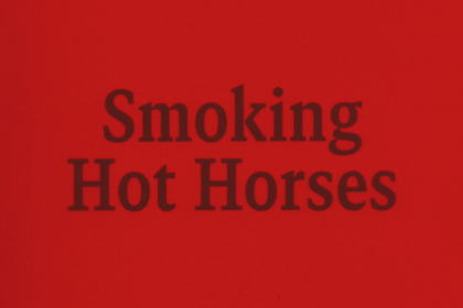
- Standard L HeavyOne of the most important factors in keeping the feet on sucklings, weanlings and yearlings in proper condition as is specified in this article is to see that you are keeping the leg in the middle of the foot, otherwise many a good horse suffers, as the concussion and strain is not equally distributed on both sides of the foot when in action.
- Standard S Heavy ItalicAn instance can be a subsequently submitted determination of a limited point in time. In most cases, however, it marks the section of a defined sequence.
- Standard M Heavy ItalicA weight here presupposes a counter there, even if that counter is nothing but the absence of its here with reversed signs. Balance does not eliminate difference; it activates it, arranges it, gives it place.
- Standard L Heavy ItalicOne of the great challenges in typography awaits both the typesetter and the type designer in the same place, and it concerns writers no less. It is not only the not-so-well-tempered poster that requires the right use of tension. It is especially the longer texts whose harmony and carrying power can be sustained only by maintaining tension.
- Standard S BlackDepends on a ruler who can be deceived, attacked, and overthrown. Higher power unfolds beyond that. Smart, gentle, even “positive” power operates through consent, self-optimisation, and internalisation, not through prohibition or force.
- Standard M BlackWhether we view design as ‘creating with existing means’ or not, upon closer inspection, design has always been about constantly arranging things, and not just since the advent of computers. The ongoing alignment of shapes, images, letters with one another and within their surface.
- Standard L BlackThe scene is laid in the house of Cephalus at the Piraeus; and the whole dialogue is narrated by Socrates the day after it actually took place to Timaeus, Hermocrates, Critias, and a nameless person, who are introduced in the Timaeus.
- Standard S Black ItalicUncle Henry never laughed. He worked hard from morning till night and did not know what joy was. He was gray also, from his long beard to his rough boots, and he looked stern and solemn, and rarely spoke.
- Standard M Black ItalicMathematically this is correct; the computational model of points, curves, and transformations retains its internal precision at any size. Yet, in practice, vectors are always realised within systems that impose discrete constraints. Every display, printer, and imaging device ultimately renders to a raster.
- Standard L Black ItalicWhether we view design as ‘creating with existing means’ or not, upon closer inspection, design has always been about constantly arranging things, and not just since the advent of computers. The ongoing alignment of shapes, images, letters with one another and within their surface.
- Settings
Typeface information
GT Canon’s design is pragmatic but not static: movement and liveliness are embedded in the letterforms. It is our answer to what our digital times require of a serif today. It’s what a contemporary serif should be in both form and function. Like its sans serif sibling, GT Standard, it aims for modern functionality rather than stylistic reinvention.
- Designed by Grilli Type
- Released in 2026
- Available in 224 styles
- GT Canon is available for customization and language extensions
- Download the free trial fonts
Typeface features
OpenType features enable smart typography. You can use these features in most Desktop applications, on the web, and in your mobile apps. Each typeface contains different features. Below are the most important features included in GT Canon’s fonts:
- TNUM
- Tabular figures
0123456789
- ONUM
- Oldstyle figures
0123456789
- SMCP
- Small Caps
Anatomy
Typeface Minisite
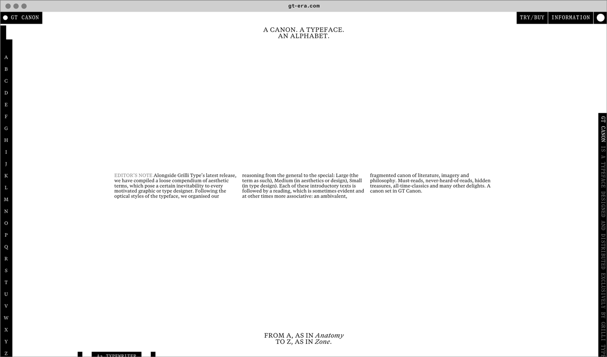
- Visit the GT Canon minisite to discover more about the typeface family’s history and design concept.
GT Canon in use